11 September 2009

projectartschool.com

projectartschool.blogspot.com is going down for a nap.
projectartschool.com/blog is waking up to new things.

as the PÄS plan rolls out, this blog will be set to the side and all new posts will be made at the new URL: projectartschool.com/blog at that blog, i will blend together the works of pd (primate design), project art school (PÄS), all the progress, process, projects, lessons, events, inspirations, motivations and art involved with the two. it's all a part of the simplifying process.

i'm still working on the PÄS logo and will post ideas to the new blog when they are ready. i would really love some feedback on those. and along with the new logo will come a new web site to carry a consistent brand for PÄS.

as for the renovation of the store, it may not look like a lot has been done, but i can assure you, it took a lot out of me to gut the place. if everything goes well, i'll be ready to move in after next week when the contractors are down building it out. again, follow the progress here: projectartschool.com/blog

this blog will still be online as a resource and archive, however, since there will not be any new posts, i feel it's appropriate to show a shot of this:


ok, now for anything new, visit http://www.projectartschool.com

thanks,
brianprince

24 August 2009

project artschool = PÄS

as i seek to simplfy life, i strive to consolidate it's contents which can be very complicated. :) it used to be family + school + work = life. the past 19 months or so i've realized that my plate was much too full. family alone occupies the largest piece of the pie and to throw school on top of work on top of it all is just too much.

i'm consolidating work and school, sorta. i haven't registered for any classes this semester, but instead will open an art store in downtown fullerton. for quite some time it's been an unattainable dream, until now. i've always wanted to be in hospitality or work with people on a retail level. being in school, i've realized some immediate needs for local artists and i'd like to offer them conveniently right here in downtown. i will combine those needs with my work, primate design. and it will all take place at 115 S. Harbor Blvd. as soon as i can get the space presentable.

the space will be called PÄS (pronounced PAUSE). it's an acronym for Project Art School, but it also voices art in general. we should pause to view art, pause in life, smell the flowers, appreciate the details and in my retail environment, i'd like it to mean linger, but move on. it's a place where you stop, but it's not the final destination. it's a place where you find inspiration, then go on to create on your own. a place to think, and ponder ideas. all that in a little word: PÄS.

as mentioned in a previous post, 27 May 2009, i wanted to open an underground art&book supply. well, this is it – only not underground. it's smack dab in the middle of downtown. the idea is to offer the exact supplies the local art professor's are requesting of their students so that they don't have to drive to westminster, irvine or pasadena to get them or pay high shipping costs from buying online.

in addition to catering to students' art supply needs, the space will be used for gallery exhibitions, professional workshops, and simply a place to come for inspiration with a library of art and design publications.

naturally the consolidation of work and school also means i'll be combining the 2 blogs to create one interesting, all-encompassing Art Blog. the look will also change as i work on a new brand for PÄS.

until then, i have a lot of work to do because this is only the beginning...


soon projectartschool.com will not be this blog, but the vision of PÄS. linger in thought.

31 July 2009

go ahead, quote me.

brianprince says:
"graphic design is electronic music, while illustration is a band. both forms of art are neither less, nor greater than the other."

yeah, i said it.

15 July 2009

kill poet press: i made it into issue 7.


i'm not sure how it happened, but i got a piece into kill poet's latest issue. i think this is my third time submitting and i finally made it in. i'm honored to be published with the likes of kill poet. scheck it out... killpoet.com

30 June 2009

happy accidents: always something fresh.

david carson defined graphic design in the 1990's. "the grunge" look was at it's peak and designers were rebelling left and right, and creating design materials by digitally spewing on the page. i'm so guilty of it and as a matter of fact, that's one the reasons i was attracted to this field. on the regular, i'm all about order, but there's something about controlled chaos that really fits my personality. the ability to use a computer to make things precise and call it art was the answer to my lack of knowledge in art, and now, ironically, i love the printmaking-splatter ink-brush stroke-torn edge-crinkle smudge stain, kneeling-on-the-floor-sweating, hands-on aspect of the work i do.

today, "grunge" has found it's place (mainly in extreme sports and occasionally the wanna-be-youth marketeers) subsiding from the mainstream. and for a little stint, the ornate, curly-q, massive-layered-patterns reigned the mainstream, but now it's all about functionality. clean, clear, concise design with the the purest of typography. driven by, i believe, the explosion of 'screen' media.

the more i experiment with "the cut-up" process and relate it to design, the more i realize that i'm way behind the current times. and i'm fine with that. cutting up design is very similar to what david carson stamped on the industry years ago. my studies this semester led me to understanding rhythm more and it's active role in visual patterns, deconstruction, book design – including syntax and the grid, and in graphic design’s general flow. (paper 1 | paper 2)

now that the semester has gone to the wayside (or wastebasket), the thought-bubble just popped and david carson splattered all over my walls. i should have been researching him much earlier. his latest werks seem to still be very contemporary to me and not necessarily '90's'. check'im out:


david carson: the new architecture book by paul anderson(harvard) and david salomon(cornell)"the architecture of patterns" covers designs in progress, june 2009.


david carson: lucky disasters. art w/out intent.


david carson: cougar paper promotion.


david carson: part of the worldwide rebranding of western union. 2009.

more resources on th eking of happy accident s:
http://www.davidcarsondesign.com
http://www.creativereview.co.uk

on another note, i've been retrospecting, or contemplating my time in this program (and yes, still wondering the what, why, and how's of it) and went back one year to spring 2008 to see the work i did. none of it is related to my visions now, but it's still a piece of me. here are a few pages of my semester-end notes from ayear ago when i was supposedly just getting my feet wet. i believe it's even pre-projectartschool.com blog.


umm, yeah.
i'm still getting my feet wet.
hmm.

28 June 2009

cut-up: preliminary concepts for show in january.

i have my first solo show in january and it's going to be based around the thread that holds my being together: words. since the beginning of my career in graphic design i've been concepting with words. and now that my run as an MFA graphic design student nears its end, i want to explore my time in words. there will be more than words in the show, including experiments with montage, the roller poem and the flicker machine strobing mad ambiance, but what it comes down to is what i see myself as – a word lover, as i've always believed: 1 word presents 1000 images in my head.

january 19, 2010 is set for the opening but the ideas are still brewing. it will be in the Center Gallery of the Titan Student Union at Cal State Fullerton which is a pretty small gallery, but will be nice and intimate with the dreamachine as the centerpiece.

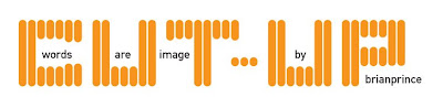
the working title is CUT-UP: Words Are Image, but very well may end up as ONE WORD PRESENTS A THOUSAND IMAGES. there will definitely be a handful of poems i've written. and i may feature a cut-up and/or visually stimulating works from a couple other artists.

- - - - -
from my proposal:

At a surrealist rally in the 1920s Tristan Tzara, the man from nowhere, proposed to create a poem on the spot by pulling words out of a hat. A riot ensued wrecked the theater. André Breton expelled Tristan Tzara from the movement and grounded the cut-ups on the Freudian couch.

A poem encourages, if not forces, one to focus on imagery, theme, and associative relationships, rather than on chronological causal structures as found in a novel or longer works of literature.

In the summer of 1959 Brion Gysin, painter and writer, cut newspaper articles into sections and rearranged the sections at random, formalizing the cut-up method bringing the collage to writers, which has been used by painters for fifty years. Writers will tell you that often their best works are accidents and manifest out of a stream of consciouness that cannot be explained. The best writing seems to be done almost by accident, but for writers, until the cut-up method became explicit, all writing is in fact cut-ups. You cannot will spontaneity. But you can introduce the unpredictable spontaneous factor with a pair of scissors. (my first experiment ://here)

Graphic Design is, by nature, completely planned mainly because the end result must be universal and legible. but i don't think the process has to be...

William S. Burroughs, who is most know for this process said,“The cut-up is actually closer to the facts of perception than representational painting. Take a walk down a city street and put down what you have just seen on canvas. You have seen a person cut in two by a car, bits and pieces of street signs and advertisements, reflections from shop windows - a montage of fragments. Writing is still confined to the representational straitjacket of the novel ... consciousness is a cut-up. Every time you walk down the street or look out of the window, your stream of consciousness is cut by random factors.”

The cut-up is a mechanical method of juxtaposition in which Burroughs literally cuts up passages of prose by himself and other writers and then pastes them back together at random. This literary version of the collage technique is also supplemented by literary use of other media. Burroughs transcribes taped cutups (several tapes spliced into each other), film cutups (montage), and mixed media experiments (results of combining tapes with television, movies, or actual events). Thus Burroughs’ use of cutups develops his juxtaposition technique to its logical conclusion as an experimental prose method, and he also makes use of all contemporary media, expanding his use of popular culture.

The cut-ups can be applied to fields other than writing. Dr. Neumann in his Theory of Games and Economic Behavior introduces the cut-up method of random action into game and military strategy: assume that the worst has happened and act accordingly. If your strategy is at some point determined . . . by random factor your opponent will gain no advantage from knowing your strategy since he can not predict the move.

The cut-up method could be used to advantage in processing scientific data. How many discoveries have been made by accident? We can not produce accidents to order. The cut-ups could add new dimension to anything — film, photography, ceramics, writing, and even graphic design. There is no reason to accept a second-rate product when you can have the best. And the best is there for all. “Poetry is for everyone.” The word is image and this will be an exhibit of image and theme, mainly through the cutting and reforming of words.

My thesis will consist of the my own personal explorations of Burroughs’ and Gysin’s experimental ideals. This exhibit is an introduction to those explorations with hopes of finding a new purpose and place for graphic design in the cut-up arena.
- - - - -

i'm excited to finalize the details in the fall. but for now, summer will be spent with the family on the road...

09 June 2009

the dreamachine: sommerville & gysin's vision of flicker.

it's been about six months now since i told myself that i was going to build my own dream machine (or flicker machine) and i've finally accomplished it. it's my first but definitely won't be my last. i used the template provided by "FLicKeR" the movie's web site (flickerflicker.com) but as i read Chapel of Extreme Experience: A Short History of Stroboscopic Light and the Dream Machine by John Geiger, i'm finding that there are many ways to make the flicker-inducing machine.

on my first dreamachine i used a world map for a couple of reasons — one to represent that the effects of flicker are universal and the visions or "drug-less high's" produced by the machine have no boundaries. secondly, as i study the Cut-Up in literature resulting in poetry, i wanted to explore the splicing of informational graphics. the idea to cut-up something is to make it your own. cutting into the world map makes new names for the places that we already know and at the same time eliminates places we know, just as the effects from using flicker — creating a new world by tapping into our memory and the imagination and bring them to our consciousness, visioning unexplained instances. i will go into the effects of flicker in another blog post.

i plan on writing down my experiences when using the dreamachine in the form of directly-written poetry. This way i can create a Cut-Up Poem without cutting it up after it's written, rather going through the cut-up process in my mind first.

here are some pics of this beautiful creation:


30 May 2009

steven heller called out my fate.

"I have finally come to the realization that my self-education was like a dormant childhood illness that has returned in adult life to haunt me." i had printed this summer-2005-article from eye magazine (eye opinion) just over a year ago and stuck it with my stash of articles that may benefit me or be of interest one day.

just like my box of inspiring printed pieces housing direct mail pieces, brochures and ads as well as my browser's bookmark folder stuffed with cool web sites, i tap into these inspiring archives when i get into a rut. i have an oversized folder with articles that i've collected from the Times, online, or Xeroxs from books and other pubs that i resort to when i seek inspiration.

i have a meeting with some gallery directors next week to discuss a show i planned on exhibiting at the end of this semester. it was for the last project in my Special Studies class in which i withdrew after 85% completion. the space wasn't available any how, but is open for the beginning of fall. my biggest dilemma is if i should still exhibit my intended show — my decades book – progress shown at the end of this blog)? or do i come completely off the wall and make a show from something unrelated?

this is why i began the search in my article archives. i have plenty ideas for an exhibit, just none have ever been flushed out... and the meeting is next week. and now after re-discovering this article, i can't help but to believe that i'm merely a "capitalist tool," as steven heller put so in-my-face-ly. but it's true. i have a knack for pleasing clients, presenting a clear message, and selling the goods. but, is my lack of formal training holding me from finding my purpose in the MFA program? am i really a graphic designer? or just a creative person with the ability to juggle administration...

i should have been accepted into this program based on a social issue/graphic design problem that i wanted to confront over the next 3 years. instead, i was accepted based upon my "corporate" portfolio. perhaps my experience proved that i could think for myself with hopes that something would surface. well, after a year and a half, nothing has surfaced and i find myself completely alone. no comradery. no direction. no push. just a demand to create my own curriculum and plan to present to a committee. the news flash is loud and clear: i just don't have it.

read heller's article published in eye magazine summer '05 issue 56: "Me feral designer" and you will see where i'm coming from.

as for the exhibit in the fall, i'm still going to attempt it. i can't give up that easily. below is where my book was going. the plan was to extract the spreads and blow them up to present in a gallery setting... now, i thinking i'll do something much more interesting. as for the book, i was exercising a flow as the reader flipped through the decades of commercial art in america starting in the 50's. a rhythm would maintain with the chorus of vellum spreads showing a graphic transition of each of the decade "circles" as they separate the decade spreads.

cover:


50s:


60s:


70s:


80s:


90s:


and the NOW is even more incomplete than the 80s and 90s... i didn't have time to massage anything and before i knew it the semester was over. as i've taken the W's this semester, i've also taken a lesson. i know who i am and i will never stop learning, i just don't have control of the time line.

finally, just for fun, even as i discovered that the decades mesh together with fuzzy borders, i wanted to explore type treatments that represent each in a poster: