27 May 2008

483A (logo and letterhead...)

the last project in special studies was to solve an identity problem for an acupuncture/fertility center in arizona. i researched a bit and explored using dots in the logomark to signify the pressure points used during acupuncture, but it wasn't really working.

that's when i realized i just needed a clean type face. i combo'd some marks and type to still realize that i wasn't solving the problem. i was enjoying the "drip/flame" mark but the idea in my head wasn't reading well on paper. and the "flower" mark represents sperm surrounding an egg by using a series of the letter "i" in a circle. it seemed too feminine if the center wanted to attract more than fertility clientele. i chose to go with a more subtle, relaxing feel.

after laying out my third round of stationery i feel i'm almost there, but i still have some work...


here's the LATEST logo treatment. i think i'm starting to like it. the "u" can be interpreted in many different ways. i like that it's embracing the "body-shaped wave" but it can also signify the penetration of this therapy. i chose soft colors because it's medical and mainly fertility-based. i avoided using any needles and as an end result, i feel it displays a calm, cool and inviting atmosphere.

26 May 2008

AIGA: get out the vote...

recently i submitted a poster to AIGA: Get Out the Vote 2008 titled, mama's voice. currently it's in the second row, third from the left.

i wrote it with the conscious we all have in the back of our minds (our mother's). and i designed it to feel like the constitution (from our forefathers). without all the splashiness, i wanted this poster to provoke thought in new voters minds.


(click it to enlarge)

23 May 2008

483A (cd packaging...)

the idea here was to take an old cd package that needed help and better it. my first problem was hard to solve because the original packaging wasn't so — in need of help. it was also very sparse as far as content (no lyrics). Apocalyptica is a group of 4 cellists that totally rooool. This particular album, they play all Metallica songs. my first thought was... classical and metal merge to create fine art with aggression. i painted a piece trying to combine the two but in the end didn't accomplish my goal. then, i thought that maybe i would do a pop-up-style, folding-frenzy-guess-type album cover. one that worked every which way you flipped it, turned it, or opened it. and the theme would be a rose emerging from the concrete (the classical/metal concept again). well, it didn't work so well. so i switched gears and re-designed No Doubt's 2000 album, Return of Saturn.

apocalyptica cover (my original logo)


apocalyptica fold one (d.p.s.)


apocalyptica full (my original illustration)


apocalyptica inside full


apocalyptica (treatment for the rose-in-concrete idea)


so, scrap all that business... here's No Doubt's redesign. in 2000, the album design was, well, 2000... when really it's timeless.

Return of Saturn.

An album that received a lot of negative criticism because of their change of style: darker, less energetic, hyped-up, sold-out... well, they didn't know the half. gwen's life during these times played the largest role in this album... as the critics expected an energetic presence like tragic kingdom, at 30 years old, gwen was actually growing up. i re-designed their packaging to portray an old poetry book checked out at the library, a huge step beyond a written diary (which would have been critic-favored). on many levels this medium is powerful. mainly because the lyrics speak her heart very much like poetry and millions of girls across america and even internationally have related to her and take her words to heart, hence the metaphor of the multiple check outs in the library. the final outcome is an old poetry book (that i produced from scratch) with the cd acting as a library card. the table of contents list the songs on the album. and there is a spread dedicated to the lyrics of each song:


since gwen is from anaheim, i went to the anaheim public library to get a stamp from them and i grabbed a book with their library card holder and i scanned both of them. the dates i used to stamp this "library card" were actual milestones in their music career up to this point.


i sketched little old school drawings but with relevant 'gwen-isms.'


21 May 2008

483E Computer Assisted Graphics (Web Design)

this course was my introduction to flash. something i've been needing... and wanting... for a while. and with the demand for it in my freelance world, i know i'll be practicing a lot. we did four projects in this class, 1) hand-coding (just basic stuffs), 2) flash animated opposite words, 3) flash intro and navigation, and finally a full flash web site (which i have yet to complete, but plan on this summer).

feel free to have a look, but personally, the only thing worth looking at is the final project: four, which isn't even complete yet. (click.)Image Hosted by project artschool

20 May 2008

483A (shopping bag...)

in special studies we were assigned a shopping bag to design. my concept was to have a bag that would go beyond carrying goods from the store to home. it would be a bag that would get some use in a way that is often viewed as negative. viewed as dangerous. we are taught to not put bags on our head as children in fear of suffocation. and as an adult we perceive it as being ugly, or in hiding.

my concept was for a toy store/discovery center.
my first comps (dinosaur, monkey and frog) we're frowned upon because i didn't create the imagery, so i decided to paint my own picture (astronaut) and produce the entire concept myself, rather than searching for the right illustrator. regardless of the execution, concept is king.

round 1 (Discovery Science Store)


round 2 (TreeHouse Toys) an eco-friendly toystore.


character illustrations by Sam Ward.


this concept also had a hang tag with instructions on how to make your own binoculars.


round 3 (ToySpace. A Place for Imagination) an educational toystore.


413 (conceptualism...)

list of (post-1945) artists covered...

marcel duchamp
piero manzoni
chris ofili
sheela gowda
nam june paik
charlotte moorman
yayoi kusama
ASCO
California Dept of Corrections
Critical Art Ensemble
robert rauschenberg
jasper johns
jackson pollock
(clement greenberg)
(michel tapie)
kazuo shiraga
shozo shimamoto
(jiro yoshihara)
georges mathieu
franz kline
yves klein
dan graham
jenny holzer
barbara kruger
claes oldenburg
coosje van bruggen
jeff koons
rosa bonheur
artemisia gentileschi
laura mulvey
kristine stiles
vito acconci
shirin neshat
yasumasa morimura
renee cox
frank stella
dan flavin
carolee schneemann
robert smithson

483A (image making...)

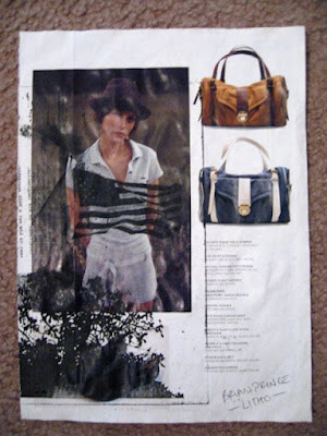
in special studies graphic design our first project was to create imagery. i snapped a bunch of black and whites and manipulated them outside of the computer which was a challenge for me – someone who's been conformed to industry. this was my first dose of 'returning-to-school' culture shock. i utilized a black and white copy machine, coffee as stain, household paint, scanning everything i could find including hair and rusty scissors, color pencil, physical distressing techniques and even smearing shaving cream on my photographs. i loved this assignment because it's real, unlike the techniques a computer does for you.

here is the image generation book showing my process of three subjects, person, place and thing:


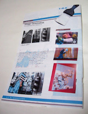
then, we were to take our images and create a newsletter around them:


19 May 2008

487D Printmaking

i love to get dirty. fingernails. forearms. elbows. the waist ring line of my t-shirt. again, i wish i had more time to dedicate to doing so. i didn't learn as many processes as i had wished in printmaking for many reasons but the cool thing is i got a foundation for etching and lithography — something every graphic designer should know. as my projects' end-results were super-novice, super-duper-novice, i still enjoyed this course and one summer would love to just fully commit to it. the word for the semester: experimental. here are some of the projects i did:

SHUTTER
lazertrans lettering on a medium that couldn't be put through a press. i wanted to really utilize the medium so i used both sides of the shutter, kind of like a tri-vision outdoor board. (ok, bi-vision, or multi-message, whatever...) i'd still like to stain it or frame it by installing it into a piece of drywall, dunno...


PLAYGROUND
creatas aquasticks printed on printmaking paper. original photo posterized and printed on lazertrans. decoupage matte medium over monoprint.


EIKON - positive
monotype print over reversed yupo stencil. original logotype. created embossed effect.


EIKON - negative
etched plate. monotype. yupo stencil. litho print. on printmaking paper.


STILL LIFE
etched "brick" pattern on plexglass. monotype printed still life. one run through press on heavy printmaking paper. below it is the etched plate.


SPACESHIP
original photo. original poem. litho print. experimented with black and red ink. i didn't bake the plate long enough and when i went to clean it, it sorta rubbed off. woops.


Random lithos, decoupage-action, ghostprints and other printmakesque type o thangs.


ARTERY
ribbed cardboard used as litho plate over rolled red ink. lazertrans heart. on parchment paper. old dairy label attached.


WANGJA
litho print on paper bag.


- - - - - - -
ok, so i never said i was good at it.