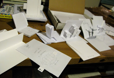

i know there is just a lot of folded white paper here, but this process helps with the form and structure of the final pieces. it will make a lot more sense as things get formalized.


i'm also pretty stuck on the SHINE stock by Reich Paper. here are some samples. i like the feel of it plus the metallic shimmer gives me an industrial look but with a touch of class which portrays my concept perfectly... "rise to the gold medal." pride. prestigious. performance.


come back soon to see how everything unfolds.


No comments:
Post a Comment