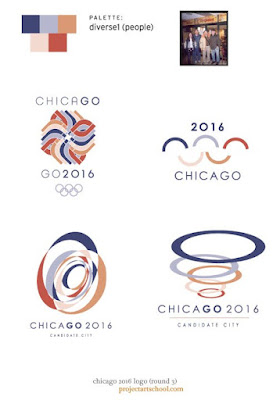
my color studies.
first i wanted to find a theme similar to the Olympic spectrum, but just varied. brighter. more muted. slightly tweaked hue. basically more flavor. then i uploaded some pictures that i felt were relevant to chicago. people. city at night. the sears tower. inside a convention. it's cityscape. even a map of the chicago area — i really liked the blues and oranges. it gave me a sea and land feeling, which seems appropriate. from there i create 5-color palettes to play with my already-designed comps and i also stumbled upon a few new ones. overall, this round (3) was in the name of color exploration and was really fun.
i know i'll be using Kuler for projects in the future.

this is one of my favorite color combos. very soft and natural. i love the blue, lime and pale yellow with orange and brown accents. may be a stretch for the olympics, but it was worth the experiment.

i really started to like my deconstructed version of Jay Pritzker Pavilion. these colors are pretty cool too, but i found myself deleting the red from these comps except in the 2"C/0"16 thingy.

this is what i mean by sticking to the spectrum, just muted. this scheme seems like a winner to me. now i just have to get the mark.

deep colors, but worth the exploration. the new marks aren't cuttin it.

softer version of the previous. based off of people in blue jeans. i like.

city nights. this feels warm, yet cool. i'm liking this classic feel.

these were the colors pulled from an existing map. and, as i'm sure the creator of the map probably used a pretty general color key, i felt the oranges and blues said chicago to me. the motion-looking one in upper-right is actually the two antennas of the sears tower, just repeated. and again the Pritzker Pavilion. diggin all of these.

a lighter, brighter version of the map colors. i like these even better than the previous. i'm also a softy for natural papers.

just more random experiments. the "O" feels too Obama... but guess where he's from?

here i tried to recreate my water color comps from round 2, but this time in vector format. they don't feel as soft and nice. next...

these final two are back to the super primary spectrum. ehh. except the two on the right are pretty cool. i like the abstract rings (but it reminds me of London 2012's logo) and the flame/towers are growing on me.

not liking the "small world" comps. dancing runner looks more like a marathon logo... next. oh, there are no more. help me decide on a mark!
for previous Chicago 2016 logo comps, click > round 1 > round 2.


No comments:
Post a Comment