31 October 2008

483A packaging. paper mock-ups.

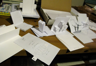
after the exhausted lists of descriptive multi-meaning words, i took them to brainstorm ideas for the functionality and dimensionality of the mailer. keeping in mind that this has to be flat and at a finished size suitable for postage, i made paper mock-ups. most of my ideas have most likely been used in children's pop-up books. i like the interactivity of a pop-up or slider because it adds another dimension to such a flat piece. it also tends to bring the value of the piece up and makes it more of collector's item rather than a piece of everyday mail.


i know there is just a lot of folded white paper here, but this process helps with the form and structure of the final pieces. it will make a lot more sense as things get formalized.


i'm also pretty stuck on the SHINE stock by Reich Paper. here are some samples. i like the feel of it plus the metallic shimmer gives me an industrial look but with a touch of class which portrays my concept perfectly... "rise to the gold medal." pride. prestigious. performance.


come back soon to see how everything unfolds.

29 October 2008

483A packaging. concept.

alas, i get around to this post. Chicago 2016 admission/welcome kit (contains a welcome to chicago letter, points of interest reference, and tickets to respective events). the next stage for the olympic assignment lead into this 3-D/interactive mailer of sorts. it's been in the works for a few weeks now, i just need to take some digi's of my progress.


the concepting began with words again. i love words. the object is to find a multi-meaning word and dissect the guts out of it. the word that fits best is RISE. it describes sport, the city of chicago and national pride to me. so from there, i twisted it, turned it, opened it, closed it, chewed it, spit on it, you name it...


beyond the word, RISE, i felt i needed another word for support. i took my second choice, GO, and went through the same process. i also like the word GO because it's a part of chicaGO... both words are actions too, which i think is appropriate for an olympic games.


all together i found myself thinking of possibilities that i probably would not have thought of without this word exploration. also involved in my concepting was paper choice (so far, SHINE, from my friends at http://www.reichpaper.com fits my concept best) and a few finishing techniques (still undetermined).

stayed tuned for the progress.

27 October 2008

Wiley design challenge.

Wiley is a publisher of books on Adobe's products. This particular contest called for a cover design for the book, Photoshop for Right-Brainers: The art of photo manipulation by al ward. i'm not quite sure why i did this except for the fact that i was taking a break from an intense freelance job and came across it on the Web. i literally read the rules and designed it on the spot. i used some of the textures i had scanned for a version of my freelance job that wasn't approved. but i don't think i would ever buy this book in the first place...so why did i do this again? weird.

photoshop-mastery isn't necessarily a huge interest for me because i'm not into photoshop tricks and such. it's a mystery why i would even attempt to enter this type of battle ground.

because, ultimately, concept is king.
and, there you have it.


here's a link to the contest. if you roll over the right side of the photo, there's a green thumbs up - use it to rank my cover. make a comment on it too! shoot, you could even rate it with 5 stars...

23 October 2008

topic statement (sorta, not really).

but, this is where the research begins...

flow
_i want to distill / discover
__the feeling / the stimulus
___obtained / created
____when forming / brainstorming
_____a subject / poetry

then
_take those pieces / matter
__rearrange them / scatter
___duplicate them / better
____chaos vs. form / extremes
_____abstract vs. structure / methodologies

process
_define something concrete / the context
__models of has-beens / analyze examples
___visual evidence / case studies
____research history / backstory
_____experiment / development

thesis.


matching the parallels / attracting the differences
dive into poetry / splash out graphic disciplines

22 October 2008

topic outline (proposal).

i've been writing down a lot of ideas and im not sure they make sense... yet. i plan on continuing to write and read and rewrite and eventually find something solid to chew on for the next stage of my life. so far, it looks like i'll explore poetry paradigm (from previous blog), i just have to find a new name for it because i'm finding that people are turned off by the word poetry.

- - - - -

here is rough outline as a basis for my thinking, step two of the refining process: topic outline (very rough initial thought).

topic summary and rationale -
creative outlets are inevetibly bound for reincarnaiton, creating and leading to some kind of formula. formulas require a process and, in time, the formation of a process is recorded. this will be a graphic design experiment. can the formulas that make great written poetry make up a new dicipline when applied to design?

I. resistance (the pre-research required) -
A. define poetry. define design. define graphic design.
B. what forms of poetry are worthy of experiment?
C. who accepts a formal style of poetry into the classification of literature?
1. as with design, in visual communication?
D. what renders a formal style of poetry to be noted worthy/unworthy?
1. who translates it?
E. how far back does poetry go? how about design?
F. what are the similarities between poetry and design?
1. the differences?

II. delimitations -
A. this is not a literary experiment — poetic paradigms will researched, referenced and used as a process template.
B. writing new or extending the field of poetry is not included.
C. designing poetry is irrelevant.

III. antecedents/precedents -
A. as of now, i cannot recall this ever being done before. with initial research, the following knowledge with come:
1. experimental – dada, perhaps?
2. theoretical – notions behind literary and design movements?
3. authoritative – socially driven?

IV. experiments -
A. define procedures within formal poetry.
1. i’m defining formal poetry as established styles/forms that have been repeated throughout history.
B. apply exact techiques step by step.
C. combine and apply different techiques creating new procedures.
D. record everything (people/books/places) including the steps, with explanations, of all procedures.

projected conclusion -
poetry is more than words and design is more than images. there are methods of order, structure and expression behind each work and shared by both genres. but what will be discovered is the synergy between each creative outlet’s structure with one another. and ultimately a new design dicipline. for better. or worse.

- - - - -

i know this needs to be taken a few steps further, so i will be meeting with my advisors this week as well as some other faculty related to the subject to discuss if i'm even coming close to something worthy of study. i just hope i can pull it off. fingers crossed.

21 October 2008

topic time.

i've been in grad school now for ten months and i finally sat down for couple hours to gather all my crazy ideas. my topic is huge, like life-huge, and i'll have to delve into it over the next 2 1/2 years until death, most likely.

- - - - -

so now for the refining process, step one: topic possibilities.

in the commercialism and advertising arena.
how deep are brands engraved into our lives. “too bad there’s a million of me out there.”

call for bedrooms - submit photos of your bedroom (teen-aged). spot where commercialism had infiltrated into our most private areas.

logo language - ask 3 and 4 year-old kids (who can’t read) to read the names of products by holding up flash cards with logos and without telling them the brand. create a sentence with logos only.

product placement - brands dictate the script. give brands a star in hollywood, not people. call for a separation between entertainment and advertising.

look for signs - find unexpected meanings and reasons for existing signs in our culture. find ways to provoke thought in public areas. do signs really work? or do we need human direction/assistance? lookforsigns.org

anti-advertising - defend humanity. create an ad campaign encouraging people to think before they buy. assist viewer in a process to make a decision based on rationale, not impulse. tell consumers that they really don’t need “it.” the largest commodity one can have is nothing.

in the literary arena.
for centuries, writers have been expressing. (period) “words don’t have brands on them the way cattle do.”

welcome to... - create a new vernacular that cannot be described in words. using symbols, braille, a constanant test, concrete/shape poetry. having no legend or key, just decifering the message by feeling or mood in which the graphic language presents. aim for provoking areas such as healing, positivity, anger and hurting.

silence - experiment with sound and how the senses react with eachother. verbal, visual as one. adding sound and touch creates another dynamic. conduct a voting pole consisting of same verbal/visual but with different sounds.

poetry paradigm - scientist come up with formulas so they can test an experiment over and over. what is the process to create a certain type of poem? what is it about a particular poem that others want to create one with the same exact format. can we design with that formula? will the same processes work with visual elements having the same viral results?

- - - - -

after all was said and done, i only found one that is personally worthy of any attention. and it's a subject that many graphic designers would shun from: literature.

i think that that's it though. the poetry paradigm... i can see myself interested in this topic for many years to come. i have a few months before i take my thesis writing class which will give me plently of time to really wrap my head around it.

delimitations: this is not designing poetry, not calligrammes, not concrete, not even writing poetry. it is the capture of the formal/informal techniques/feelings in written poetry translated into a discipline for design.
far-fetched, right?
perfect.

18 October 2008

history of graphic design: essay three.

i'm in between soccer games right now. i'm the coach for one of my son's teams, betcha didn't know that. with that said, it's been a very busy week, and somehow i managed to squeeze in time for my history class. our third essay, "Fighting the Image Wars," by steven heller kind of threw me for a loop. i'm not sure what his intentions were, but more than anything, i felt i was reading a world history report. perhaps that was his purpose. in the end, i agree with his position and admire his place in graphic design criticism, but in my paper, i'm pretty sure i came off too negative. perhaps i was searching for the relation to graphic design too closely or maybe it was the fact that i didn't sleep the night before (ok, maybe an hour catnap) or maybe it was that i wrote it while eating breakfast at Denny's by myself early thursday morning. i don't know why i always have to order the sausage. bleh.

in summary, the essay is about whether or not the people should be restricted by our government to view certain images from sensitive arenas (such as war). and if gov't has control over it in the first place. and is it the editor's responsibility for what gets filtered to the people? are they hiding the truth... for the people's sake? for the government's sake? or just for grotesque's sake? i got caught up on the title, questioning his term, "Image War." to me, it's more about a revelation than a war. more times than not, the truth hurts. how long can one be protected from that.

my pdf write-up is attached //:here. i apologize if it comes off negative. i'm really not that grumpy.

10 October 2008

credit card art: and fraud.

tuesday evening was a little shocking to say the least. i received a call from the bank saying that the primate design bank account was a victim of fraud in new york. i knew that i was certainly not in new york earlier that day pumping gas, so they told me to shred the card as they canceled it on the spot.

for therapeutic calming, i gladly cut the card. cc1

and displayed it nicely on the shelf.
cc2

i'm grateful for banking with such a great institution. they already took care of the mess and issued a new card with new number. all i needed was a little art to pass the time.

08 October 2008

483A logo. round 4. semi-finalized.

today we turned in our process books for the logo and some clean final prints of our best. next project is packaging, but i'll be doing a direct mail piece about the olympics because i wanted to continue my theme. i will, however, make it 3-d in some sort by way of it opening into a pop-up or with creating an element of surprise by unfolding, pulling, etc...

below are pics of my final mid-semester logo work. i was encouraged to continue refining my mark, so down the road i'm sure i'll blog the final for this project. the direction i got was to simplify some of the clutter in my deconstructive logos...

here are 80 logos that didn't make my final four cut.


here are my final four.


here's my process book with everything.


the process book covers approx. a month's worth of work.


everything from my indexical list to experimental brush strokes and textures.


i'll blog later about our next project. we already started the brainstorm process. again, we use words as a starting point to concept the design. i'm beginning to like this because i love words and always found myself concepting that way when i lived my agency life.

01 October 2008

483A logo. round 3. color studies.

here it is. the project that seems to be ending my life. but, at least i'm having fun in my sleep deprivation. i really enjoyed exploring color with these logos. i'm not sure how far i can stray from the original olympic "rainbow" palette, but i was turned on by Kuler, the free online color theme creator through Adobe. you can upload a picture and it will pull the colors that compliment each other. there are also themes you can browse. it's rad.

my color studies.
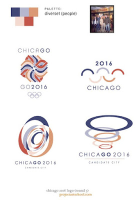
first i wanted to find a theme similar to the Olympic spectrum, but just varied. brighter. more muted. slightly tweaked hue. basically more flavor. then i uploaded some pictures that i felt were relevant to chicago. people. city at night. the sears tower. inside a convention. it's cityscape. even a map of the chicago area — i really liked the blues and oranges. it gave me a sea and land feeling, which seems appropriate. from there i create 5-color palettes to play with my already-designed comps and i also stumbled upon a few new ones. overall, this round (3) was in the name of color exploration and was really fun.

i know i'll be using Kuler for projects in the future.


this is one of my favorite color combos. very soft and natural. i love the blue, lime and pale yellow with orange and brown accents. may be a stretch for the olympics, but it was worth the experiment.


i really started to like my deconstructed version of Jay Pritzker Pavilion. these colors are pretty cool too, but i found myself deleting the red from these comps except in the 2"C/0"16 thingy.


this is what i mean by sticking to the spectrum, just muted. this scheme seems like a winner to me. now i just have to get the mark.


deep colors, but worth the exploration. the new marks aren't cuttin it.


softer version of the previous. based off of people in blue jeans. i like.


city nights. this feels warm, yet cool. i'm liking this classic feel.


these were the colors pulled from an existing map. and, as i'm sure the creator of the map probably used a pretty general color key, i felt the oranges and blues said chicago to me. the motion-looking one in upper-right is actually the two antennas of the sears tower, just repeated. and again the Pritzker Pavilion. diggin all of these.


a lighter, brighter version of the map colors. i like these even better than the previous. i'm also a softy for natural papers.


just more random experiments. the "O" feels too Obama... but guess where he's from?


here i tried to recreate my water color comps from round 2, but this time in vector format. they don't feel as soft and nice. next...


these final two are back to the super primary spectrum. ehh. except the two on the right are pretty cool. i like the abstract rings (but it reminds me of London 2012's logo) and the flame/towers are growing on me.


not liking the "small world" comps. dancing runner looks more like a marathon logo... next. oh, there are no more. help me decide on a mark!

for previous Chicago 2016 logo comps, click > round 1 > round 2.